Tuesday, 18 June 2013

Typeface

Typeface can be defined as a set of one or more fonts that each alphabets share a common characteristics, patterns or design features.

The assignment given to us for this topic is to create a typeface for our names. Therefore, I used brown and green as the main colours which looks like plants with its branches and leaves for my typeface, and I referred to a font named KINGTHINGS EMBROIDERY in drawing this typeface of my name:


References:
DMCA. (2013).  Kingthings Embroidery. Retrieved from http://www.fonts101.com/fonts/view/Uncategorized/42279/Kingthings_Embroidery

Monday, 17 June 2013

Art Movement

Art movement is an artistic style or tendency that can be seen or observed through the artworks of a number of artists, when there are similarities among the techniques, goals or philosophies they have embraced. Art movements have each thrived for a limited time, which can be measured in the terms of months, years or decades. Until now, there  are many art movements that have been developed.

Among all types of art movements, my favourite art movement is modern impressionism. Impressionism is the style of painting developed in France at the end of the 19th century. In the year 1874, many artists contributed to the first exhibition of impressionist painting. The examples of artists involved are:
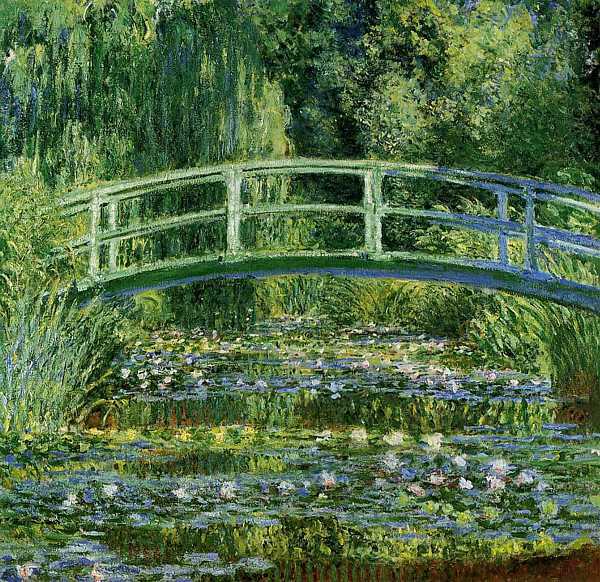
- Claude Monet (1840-1926)

  Waterlilies and Japanese Bridge (1899)

- Pierre Auguste Renoir (1841-1919)

  Fruits of The Midi (1881)

The characteristics of impressionist paintings:
1.) Relatively small, thin, yet visible brush strokes.
2.) Open composition
3.) Emphasis on accurate depiction of light in its changing qualities (often accentuating the effects of the passage of time)
4.) Ordinary subject matter
5.) Inclusion of movement as a crucial element of human perception and experience
6.) Unusual visual angles

Impressionism is all about the way of life lived in bursts of brief encounters in the city. For example clouds that moving quickly, sunshine that reflected on the water surface and so on. Therefore, it also can be concluded that impressionism is also about modernity. The artists who immediately jot down the instances of this modern life were thenn called "Impressionists" and their paintings were later known as "Impressionism".

Impressionism created a new way of visuality, which also means that a new way of seeing this world. It is also a record of the way of the artists perceive towards the city or even the countryside as morrors of modernization. Hence, modernity has became their subject matter.

I chose modern impressionism as my favourite art movement simply because among all the other art movements, it stands out and attracts me at my first sight of seeing it. I feel a sense of comfortability and calmness whenever I look at a modern impressionism painting. I love the way of the modern impressionists express their perception towards the simple things around them through their paintings. Besides that, the colours usage applied in modern impressionism paintings impressed me. I love the colours and techniques used in painting the modern impressionism artworks. If I am given a choice, I will also choose to learn this style of painting and art movement.

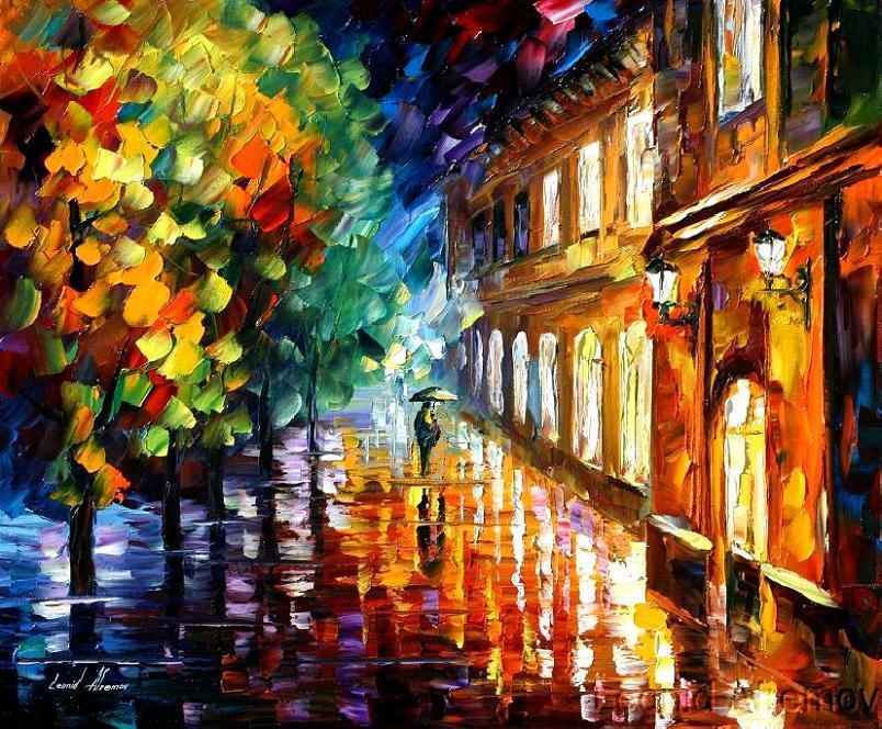
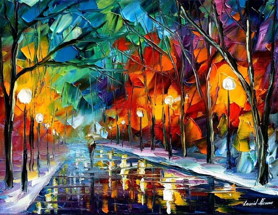
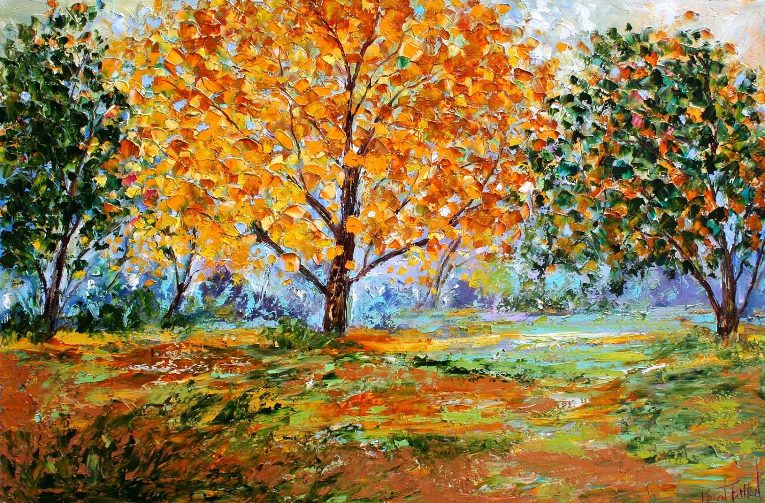
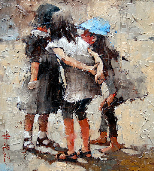
MODERN IMPRESSIONISM PAINTINGS


Modern Impressionism Palette Knife Oil Painting


Palette Knife Painting 2011


Autumn Splendor (Karen Tariton)


by Andre Kohn


References:
Delahunt, M. (2010). Art Movement. Retrieved from http://www.artlex.com/
Gersh-Nesic, B. (1869). Impressionism-Art History 101 Basics. Retrieved from http://arthistory.about.com/od/impressionism/a/impressionism_10one.htm
Impressionism. (2013). Impressionism and The French Impressionists. Retrieved from http://www.artyfactory.com/art_appreciation/art_movements/impressionism.htm


Shapes & Patterns

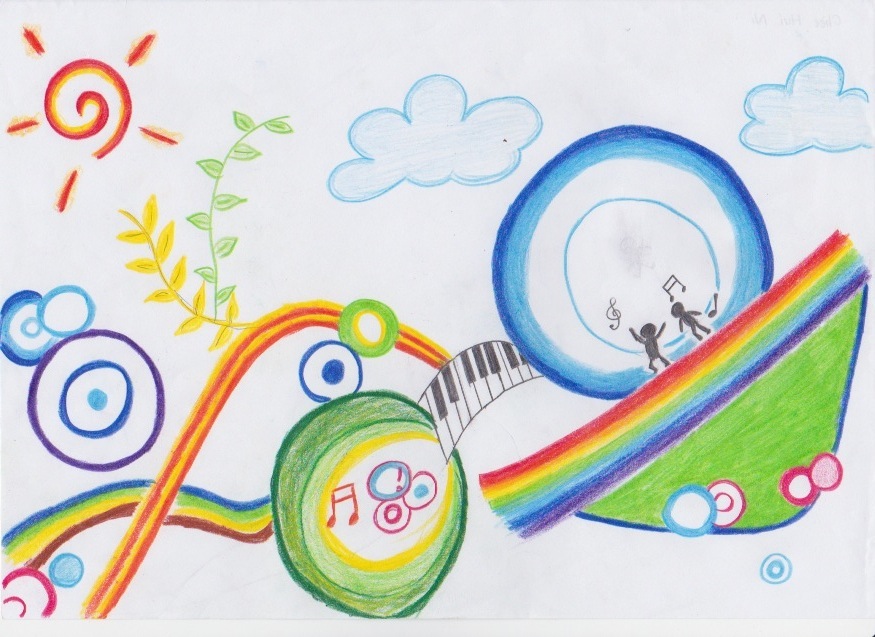
We are required to create a drawing based on the design elements and principles that we learnt in class. The picture below shows the drawing I created for this tutorial exercise :

There are several things that I learned through the lecture on Design Elements and Principles were applied into this drawing.
Design Elements
There are a few design elements that I used in this drawing. One of them is lines. Lines can be in various appearances. They can be in curve, straight or even irregular shape. In this drawing, I used a lot of lines to form various shapes and objects. For example, curve lines to form the rainbows and a combination of straight and curve lines to form the piano in the middle of the drawing. Besides that, the shape elements were also applied in this drawing. Shapes were formed when a line encloses an area. The shape that I used most in this drawing is circle. I used circles of various colours to create the feeling of happiness and joy in this drawing. 

Design Principles
While the design principles that I applied in this drawing included emphasis, harmony and repetition. Emphasis creates a focal point in a drawing. The largest circle in the drawing was being emphasized by adding two shadow dancing along with the music in the surrounding. Other than that, I created harmony for this drawing by using repetition and rhythm of the colourful circles and most rainbow colors complemented each other perfectly. Finally, it can be obviously seen that repetition principle was widely used in this drawing. Repetition creates rhythm. Repetition doesn't necessary has to be exact duplication, it can also be in the form of near duplication or duplication with variety. Therefore, I repeatedly using circles of different sizes, colours and slight different in the patterns. 

Wednesday, 12 June 2013

A Picture Is Worth A Thousand Words

A picture is worth a thousand words.  Photographies are not just simple picture that made up of images and colours, they are that can reflect their spirits and hearts within the photographs, and able to tell the person looking at the photograph what the photograph trying to say.  Some meanings may not be able to be expressed by words, but through photograph, every message can be conveyed.


This photograph entitle "Innocence" was taken by Michele Taras. It is one of the exhibits in Center for Fine Art Photography Gallery Juried Show in the year 2007. This award-winning master piece of photograph shows me the pure and innocent heart of this child through the facial expression of this child.  This child was subconsciously trying to hide behind the pillar, showing his feeling of insecurity.  Maybe he is feeling unsafe when the photographer is trying to approach and go near him.  Besides that, a boy walking around outside of the house without wearing shirt/clothes show his life of poverty. Another evidence of his poverty life can b e seen through his body shape. His skinny body with a round stomach is one of the symptoms for a disease named kwashiorkor, which is a disease caused by malnutrition of protein-energy. It occurs more often to children who live in hunger. The child's eyes show a sense of helplessness of going through hardship but also a sense of innocence where he has to face all these hunger and poverty in such young age. He was wondering whether he can see a bright future ahead.


Reference:

Tuesday, 4 June 2013

Colour Of Nature

Colour is also considered as one of the element of art. The colour of an object can be seen when white light is shone upon the object's surface. The surface of that object will reflect some colours, absorb the others and the final result that can be seen with our eyes is the reflected light. 

There are a vast amount of different colours that exist in this world, and different colour carries different meanings and has different functions. Every single individual thinks differently, thus, it is normal that everyone has his/her own favourite colours which may not be preferable for other individuals.
As for me, I have two favourite colours, which are blue and white.

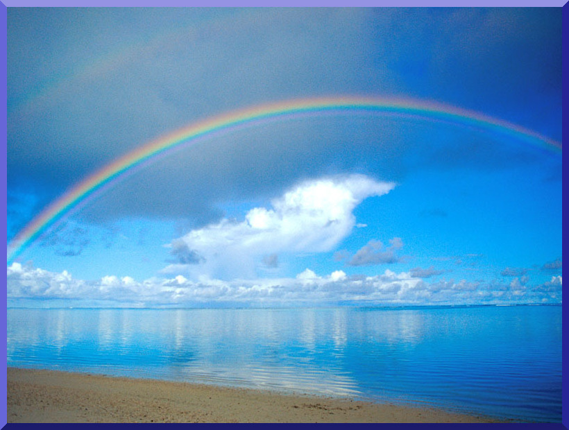
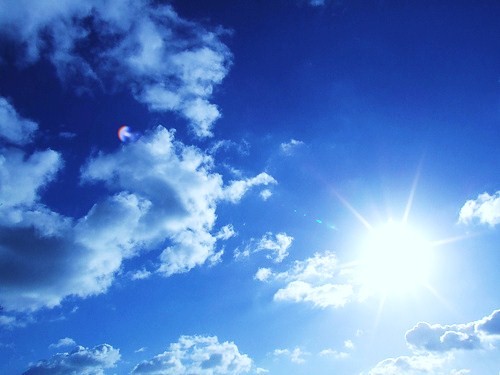
The main reason that makes me fall in love with these two colours is because of the sky, which is considered the colour of nature to me. Whenever I look at the sky, I can feel a sense of calmness and peacefulness deep inside of me. However, not only when the colour blue and white combines together, I also like these two colours individually.
 Seaside 
Blue Sky   


BLUE
Blue colour produces a calming effect by slowing down human metabolism. Hence, it is always associated with tranquility and calmness. Blue is often used to symbolize trust, loyalty, confidence, wisdom, intelligence, faith, truth, heaven and so on.
However, I prefer light blue more. Too much of blue will create the sense of melancholy, sadness and negativity. Therefore, a colour can actually have different effects on an individual when the tones of colour varies. To make sure our favourite colour helps us in our daily life such as help us in relaxing, we have to be sure of what kind of colour will really helps us in achieving the positiveness we want.


                               Blue Flower       
Elementos azules
Blue Pebbles                    


WHITE
White colour is an inherently positive colour and it normally used to symbolize purity, innocence, goodness, light, cleanliness, faith, sincerity, softness, perfection, and so on. White colour can affect our mind by promoting the feelings of fresh beginnings and renewal, assisting in clearing and cleaning of obstacles, and also encouraging the purification of thoughts. The non verbal messages that white colour may convey match the objectives that I am trying to achieve in doing anything. For example, being perfectionist to make sure all of my things being done as perfect as possible, being totally sincere to the people around us, including friends and family, and also being positive-minded when facing challenges and obstacles in life.


References:
Bourn,J. (2010). Color Meaning: Meaning of The Color White. Retrieved from http://www.bourncreative.com/meaning-of-the-color-white
Color Wheel Pro. (2011). Color Meaning. Retrieved from  http://www.color-wheel-pro.com/color-meaning.html
Esaak,S. (n.d.). Color. Retrieved from http://arthistory.about.com/cs/glossaries/g/c_color.htm

Sunday, 2 June 2013

Design Principles

Design principles are the basic laws applied when constructing a visual images. It suggests how a designer can organize and arrange various design elements to the final overall design.

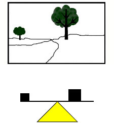
<BALANCE>
  • Sense of equilibrium.
  • Places different parts of a visual in an aesthetically pleasing way of arrangement.


<PROPORTION>
  • Relationship between two or more elements in a design.


<RHYTHM>
  • Movement in which some elements recurs regularly.


<EMPHASIS>
  • Creates a focal point in a design.
  • Attracts attention to the most important element in the design.


<UNITY>
  • The relationship among the elements of a visual that helps all the elements to function together.
  • Gives the visual a sense of oneness.
  • Organizes an image, helps in facilitating images and understandings.
  • Can be achieved through the use of similar shapes, common patterns and common background.


<HARMONY>
  • All parts of elements in a visual image relate to and complement each other.
  • Can be achieved through repetition and rhythm.


<REPETITION>
  • Tends to unify the total effects of an artwork.
  • Creates rhythm.
  • Can be in form of exact duplication, near duplication, or duplication with variety.


Design Elements

Design elements are defined as the basic units used in constructing a visual image, which can also be described as the building blocks in the building of visual image. There are six various design elements:
POINT
  • Functions as a focus point which can draw viewer's attention to the main information.
  • Combinations of points may form more complicated ideas.


LINE
  • Can be straight, curved or irregularly shaped.
  • Helps viewers to visualize objects within minimum of time.
  • Form shapes.
  • Acts as borders between steps, ideas or concepts.


SHAPE
  • Formed when a line encloses an area.
  • Simple shapes are remembered more easily compared to complex shapes.


VALUE
  • Defined as the relative degree of lightness and darkness in a design element.
  • Used to describe space and shapes.
  • Dark areas normally denote gloom and mystery.
  • Light areas normally denote happiness, warmth and fun.


TEXTURE
  • Surface characteristic of materials.
  • Can be experienced through sense of touch / illusion of touch.
  • Used to accent an specific area to show domination.


COLOUR
  • The part of light that is reflected by the object we see.
  • Primary colours : red, yellow and blue.
  • Mixture of any two primary colours result in secondary colour.